

Take a look at this website:
And now, take a look at this website:
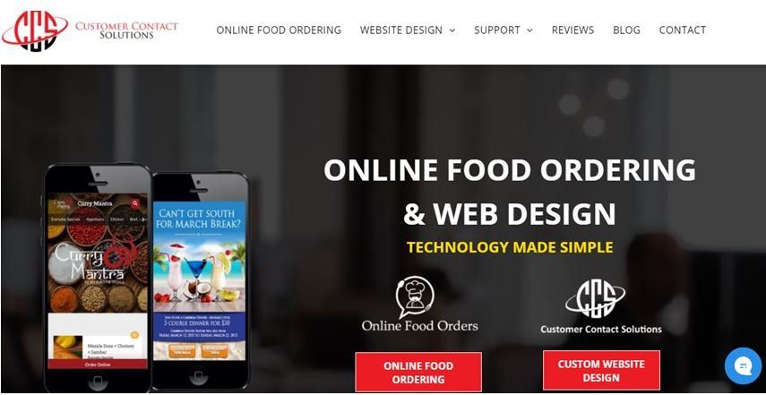
They are clearly two different websites, but cater to more or less a similar audience—both websites are businesses that have to do with edibles/food as products/services. Think about it, which of these websites are you likelier to order juice from?
If your answer is the second, then we can explain why:
What’s Wrong with the First Website?
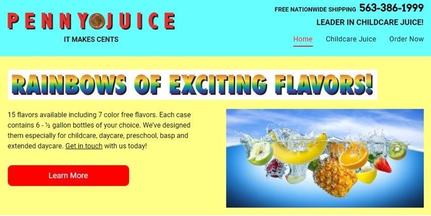
The first website has some standout characteristics, of course: it has the business number displayed clearly on one end, and you can tell the content creators did do a good job of trying to make a clever slogan: Pennyjuice—it makes cents.
However, that’s where the good ends and the bad begins. The website:
- Uses two very bright, very jarring colors in one frame that are not pleasing to the eye.
- Uses a bright font in childish colors—and has the RAINBOWS OF EXCITING FLAVORS part pasted onto a white surface, and then included in the main frame. That makes it three jarring colors.
- The font is difficult to read and off-putting. Moreover, it can also be hurtful to look at for people with weak eyesight or eye problems.
- Self-describes themselves as a “leader” in childcare juice—and superlatives are always a bad idea when you’re trying to establish yourself as a reputable business.
- Uses an image that is very obviously a stock photo—and a poor quality one at that.
What Works for the Second Website
The second website, on the other hand, has none of those problems:
- It has clear, readable font in one color that makes it legible and readable.
- It does not make any grand claims in the superlative.
- Uses a clean design.
- Has an easy, accessible navigation system and a menu that is very visible.
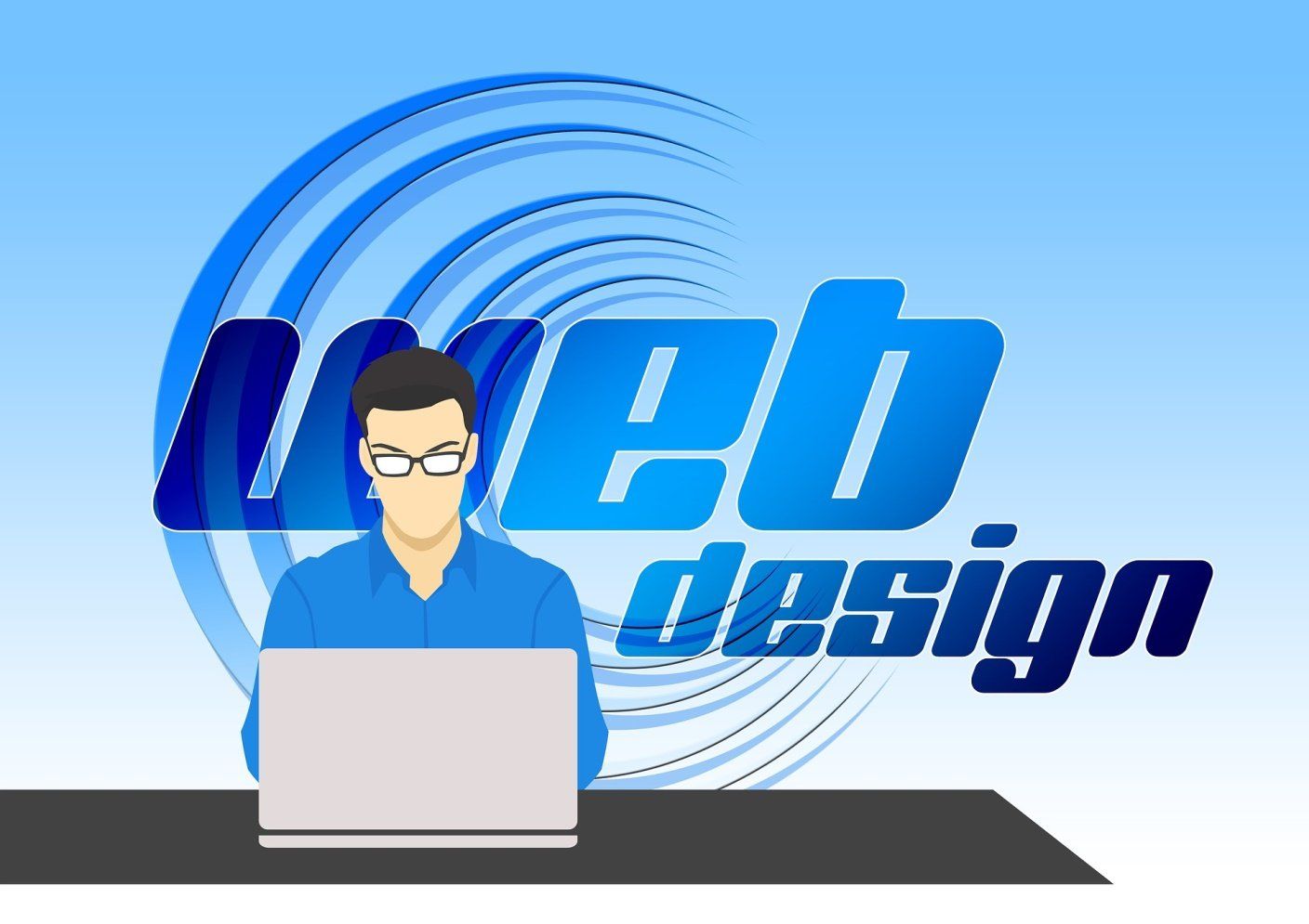
What Makes a Good Website Design?
On the basis of this comparison, we can surmise that a good website design:
- Has clean interface
- Uses a font that is easy to make out and read
- Uses good-quality photos
- Is easy for the customer to use
- Has no clutter, and does not have multiple jarring fonts or colors to make it painful to the eye
Does not look lazy—if you look at the first website, then you can see how it has only four rectangle boxes that are passed off as design. The image, however bad, has not been edited using a tool such as Photoshop to make it look more at home.
Like the Second Website Design?
Now you, too, can ask the creators of that website design to design your website for you.Reach out to Customer Contact Solutions to discuss a website for your Ontario-based business.